Esri came to us for an outside perspective on one of their products: Esri Living Atlas. Their creative head and owner, Jack, was unhappy with the UX and product as a whole. After a round of user research, I discovered the site needed to be split into two pages: a landing page with an explanation of the product and a search page.
Below you’ll find a summary of design intent for each section as well as any user research takeaways that helped mold the final recommendations.

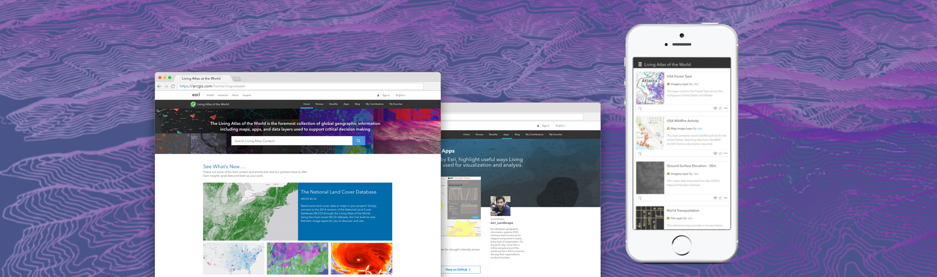
Hero Image
After doing some secondary research, I discovered there's a reason for the proliferation of the google-style minimalistic landing pages with the oversized search bar. It speeds up comprehension of the intent of the product. It also increases engagement with users new to the product. I decided to make a collage of the most visually striking GIS content the Living Atlas has to offer as a background. This in combination with the branding statement was well received by users new to GIS.
See Whats New
The target users for this product are intermediate to advanced GIS users. After an A/B test I discovered they were most excited about this media section where they can get a curated view of the best of Living Atlas content. This was originally much lower on the scroll but due to their feedback it was moved up to prime real estate.
Browse Content
Esri has a fair amount of branded items with very similar names making the learning curve quite steep for people new to GIS. In order to mitigate this problem I created this section to visualize and explain all of the content types, focusing on their differentiating factors.
How to use living atlas
Another point of confusion with Living Atlas is what exactly to do with the content. Is it the chicken or the egg? Is this a collection of finished maps or pieces with which to create maps? In actuality it’s both. People can come here for inspiration or grab data and layers to pull into their projects. This high level explanatory section is intended to clear up that confusion.
Grab Content and Start Creating
In order for people to understand the power of Living Atlas they must grab some content, pull it into a map and start playing around with the layers. The goal of this call-to-action is to expedite a person’s journey from being someone just interested, to becoming a power user. I added a link to the search page in hopes people will take the bait and start grabbing content now that they have a full understanding of The Living Atlas and what it has to offer.
Meet some of Esri's Contributors
Like most open source products, Living Atlas is only as good as the contributors. Yes, a large portion of this content is from Esri however it’s important to encourage people to contribute and get those hidden gems out there for circulation.
Have Questions?
After talking with a couple of the designers over at Esri I discovered there is a Living Atlas discussion board where people can get their questions answered. Community is often a crucial element to keeping users engaged and ease frustrations. Because of this I thought it was important to incorporate into the landing page as a finishing touch.
Check out the final product
Final Thoughts
This redesign was well-received by the esri team and has been implemented. It will be difficult to track to metrics on how many novice-to-power users the new design creates. However, new members of our team at Blue Raster found the content-description section and directions on how to utilize Living Atlas very helpful without knowledge of my design effort.